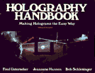
Holography Handbook
What started out as a pamphlet to be done in 6 weeks turned into a book published 4 years later.

This is intended to spark your imagination into thinking about QuickTime in a more frugal way.
QT compression techniques were designed to cut back on the vast amount of data that a computer must deal with to display full color images in a quick sequential way. Unfortunately the hardware hasn’t caught up, so it still can’t handle the diminished data as elegantly as it will some day. In the meantime, it demands large storage space, special video cards, and patience from its initial explorers and adventurers.
Why wait? Utilize the technology by meeting it half way. Forcing less data through the channel allows QuickTime to do less work with plenty of disk space left over for everybody. Fewer colors mean less data, smaller movie windows mean less data, minimal movement means less data, lower frame rates mean less data, shorter, more succinct movies mean I think you get the idea.
A Stack can become a black & white movie
A Hypercard stack can be a great drawing board for creating a simple black & white animation. Each card becomes one page in a sequential flipbook. A simple HyperCard script (show all cards) will flip through the cards in rapid sucession creating the illusion of movement on your Macintosh screen, essentially basic animation.
This stack animation can then be made into a relatively small Moov file that can be shown on any Macintosh as a QuickTime movie (without the dependence on HyperCard). This means you can trade movies on floppy discs, promote yourself with living business cards or just show instead of tell.
A HyperCard stack called Stack to PICSFile. It’s pretty self explanatory and the PICS file it creates can be converted with MoviePlayer into a QuickTime movie.
Resize your movie frame
With a stack you can create movies of odd shapes.This movie was originally created card by card in a HyperCard stack that had been resized horizontally to 104 pixels. It’s easy. From the Objects menu, choose Stack Info, then select Resize, drag the bottom right corner of the box till you have the size you desire. Viola! The pop-up menu also gives you a myriad of choices, one of which is Small (a logical choice if you’re trying to save space) Remember the bigger the movie window, the more information, the larger the file size.
Downsize your big movies
Another way to save K’, utilizes MovieConverter (Apple’s Starter Kit) to downsize the movie frame. Increments of 25 seem to work the best.When converting a stack, PICTs or PICs files, choose More, type a lower number than 100 in the second dialog box. Line drawings, sillouettes, and lightly greyed images seem to retain their image quality the best, while complex grey patterns in drawings or scans tend to blotch up into big black unrecognizeable blobs. Experiment with your image, (preferably before you do an entire animation) you might get lucky, as in the case of this shrunken 50% version of the Horse (compare with the 100%) where the scanned image of the television still visually ‘reads’. The size of the file is about 60% less and also leaves more space on your card for interactive text, instruction or other movies.
A little movement goes a long way
Elegant storytelling uses few words to convey the intended meaning. Frugality of movement saves you work and production time, is not as taxing on the CPU, and may communicate your point more directly. This animotion was created by making incremental paint changes to only the eyes and mouth and adding an everexpanding bubble on the card layer. The head never moves a muscle/pixel and in fact was drawn once in the background layer and allowed to peek through on each card. The ‘story’ did not demand action from anything except the bubble and reaction from the eyes. HyperCard’s background is powerful in that you can create a static image once that can ‘anchor’ your animotion and save you lots of work.
Fewer moving pixels make for smaller Moovs
With video there is a whole lot of pixel updating going on in the background of a scene that may not contribute to the telling of the story. It looks great but why store or force your computer to process this non informative information? The simpler the movement the smaller the file. How minimally can you get your point across or convey an idea? Think of this as an exercise in creating a visual haiku, the richest meaning with the fewest words or in this case, pictures.

What started out as a pamphlet to be done in 6 weeks turned into a book published 4 years later.

Edited and wrote this piece for BMUG’s biannual newsletter along with several other issues. This extols the virtues of Adobe Premiere.

This San Francisco Examiner article written by Scott Rosenberg explains this wonderful project and includes a ‘pivotal’ quote by me in the 3rd to last paragraph. 😉